woensdag 20 juni 2012

CD Cover completed!!!!

Although I haven't printed the CD Cover yet I have finished illustrating it and also got it ready for printing.

I was originally just going to make it as a standard CD Cover in a typical jewel case but I decided to go with the carboard covers often seen on folk cds special editions and any others that want to be a bit different.  I definitetly prefer them to the jewel case covers anyway. 

Because of this the booklet changed slightly so instead of seeing this....


 ...you'll see this:


So basically when the cd cover opens you have the booklet glued in on the left with this as a seethrough first page.  On the right will be a card pocket for the CD to slide into.

The next challenge was the text to put on the front.  At first I thought I could use arrow shapes to go with the archery theme but it ended up looking too Metallica.  Then I tried doing kind of trre shaped letters which really didn't work.  Instead I went with rounded letters which I felt went a lot better with the whole atmosphere.  Here you can see I accidentally did a j instead of a g, oops.


 I got it right on the cover though.  I used the tracklisting page I previously made for the booklet on the back and stuck with the golden theme I had previoulsy ised on the text.


 Next I added the title to the CD sticker:


And finally I designed theCD pocket.  I just used the same painted texture as before to keep it all a good unity.  I decided to put the lyrics to their song Ancient Forest here as they were an important part of the concept and I feel they will add meaning to the booklet and help the viewer get more out of the concept.


 I have printed out the tree pages on the transparant paper; they look really cool.  Amazingly enough I only jammed the printer twice :P


zaterdag 9 juni 2012

CD-Cover... Getting There :D

The next challenge after having painted all of the pages was of course to add the backgrounds.  To get the backgrounds in I had to rub out all of the white on paintings in Photoshop.  This took horrifically long and was very torturous :D but I can't stand it when people cheat on this and it ends up looking crap so I just took my time.

As I had done in my earlier Herne experiment I painted the background in two layers: acrylic and ecoline.   I stuck mainly to green based backgrounds to keep the foresty feel but I did make them different greens because I felt that went better with the different tree concepts.


It took a while fiddling with the colours but I'm happy with them like this.  After having done this I painted the trees for the transparant pages, I kept them reletively simple and managed to get them all done in a day which, considering my usual speed, was great.

Lots of green trees here for Robin to hide behind. The right-hand half will be on transparant paper overlaying the Robin page and the left-hand page will be on normal paper. I was going to add the credits thoughout the other pages but when I tried that the pages became so chaotic I felt it was better to do it like this.


Here's Herne's oak tree. I kept it over to the left so that you can easily see Herne but that Albion will only be revealed after having turned the page.


This is the front half of the circle of trees...


...and this is the back half of the circle of trees.  As you can see (and as I've mentioned earlier) this section is on two pages.  It is in the centre of the book so there had to be a double page due to binding order.   Also by overlaying the two pages there will being more depths to the circle of trees and make it more comprehendable.


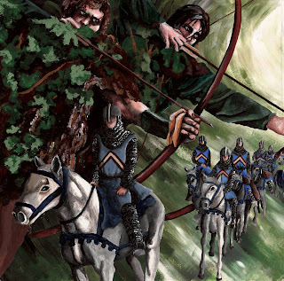
I decided to go for leaning trees for the battles page because they always remind of the way two armies storm towards each other.  And also obviously a stump as a symbol of destruction.

I quickly put the two pages over the top of each other in photoshop to get the general idea before printing.  Obvioudly they will look a bit different.


This is the start of the CD Design.  It will have text on it as well like the text above.  I tried at first by taking details out of the above pages by I decided I didn't want anything too complex as there's already a lot of imagery.  


 I'm really happy so far with this project.  Although it seems like it's taken a long time, if I did it all in one go I could have probably made it in 1,5 to 2 weeks so that's not so bad considering the amount of work that goes into the painting.


woensdag 6 juni 2012

Meghan Cole and Ben Templesmith

Last week I received emails from both Meghan and Ben. 

Like Godmachine, Ben Templesmith gave some very handy tips to improve my picture.  He too pointed out the light direction problem and that I had to make it more clear from which angle this was coming.  He also felt that the fly should appear dirtier to make it more scary and more within the theme.  He personally also felt that the colours were too much and that I should limit them a bit to try and add extra definition on the reflection. 

Meghan was really happy with the designs and she said it technically was definitely printable.  As she has trained as a printmaker I was thrilled to hear this. One of two things pointed out was that the print on the front of the T-Shirt needed to be lifted a bit, I agreed so I have.  The second was that the design may not print well on the cup due to it being coloured print on a black mug.  She did suggest that of the whole thing was printed onto a layer of white this may work.  She felt that the concept was an original and interesting take on the play and added a new angle to it.  She thought that the design would sell well in their shop and that it would be good for both genders.  She said a whole load more but I've printed that out tell you about later.


TIME COUNT - 28/05-03/06

+- 32 Hours 30 Minutes

Shakespeare in London, a change of view

Thursday and Friday, 31st of May and 1st of June and an extra five hours in the Weekend

First of all I painted the Shakespeare Bust which is part of the memorial to the First Folio being printed.  This completed it meant that the whole of the North section was completed.

After having done, I really felt that this particular project was taking too long for what it was.  I decided as this point to stop painting the other elements and see if I could just fit them together as they were.

I kept all of the North location North and thes rest underneath.  Instead of using the Thames I decided to put all of the locations on one street. I think the way the Westminster Shakespeare is standing on the ground really does look very cool :D 


After have done this I thought the Southwark window really didn't look good in the picture anymore.  It is of a higher detail than the rest and as you can see suddenly a huge bloody load of blue.  I decided to take it out and enlarge the Globe Theatre as that really looked too small as well.  I proably will add a bit more texture to the road to make it a bit more clear.


I then added the title to the picture.


I decided to put the window on the back of the information pamflet together all of the location information (still to be added) as there is no disturbance on that side with other colours etc.

Battles

Tuesday and Wednesday, the 29th and 30th of May and a bit of Thursday the 31st of May

These days were basically the big push to get the last major page done for the CD Cover.

I did enjoy doing these pages but I don't really feel it's a realistic of doing a CD Cover.  I don't feel that I would ever get a decent amount of money for a CD Cover to warrant all of the time I've spent on these paintings.  It's not so bad if it's just for a one image project but having to a whole series like this is not too good.  Although I was happy with the outcome this stage and I am glad I took the time to do it like this.