Last week I received emails from both Meghan and Ben.
Like Godmachine, Ben Templesmith gave some very handy tips to improve my picture. He too pointed out the light direction problem and that I had to make it more clear from which angle this was coming. He also felt that the fly should appear dirtier to make it more scary and more within the theme. He personally also felt that the colours were too much and that I should limit them a bit to try and add extra definition on the reflection.
Meghan was really happy with the designs and she said it technically was definitely printable. As she has trained as a printmaker I was thrilled to hear this. One of two things pointed out was that the print on the front of the T-Shirt needed to be lifted a bit, I agreed so I have. The second was that the design may not print well on the cup due to it being coloured print on a black mug. She did suggest that of the whole thing was printed onto a layer of white this may work. She felt that the concept was an original and interesting take on the play and added a new angle to it. She thought that the design would sell well in their shop and that it would be good for both genders. She said a whole load more but I've printed that out tell you about later.
Posts tonen met het label Hellblazer Comic Cover. Alle posts tonen
Posts tonen met het label Hellblazer Comic Cover. Alle posts tonen
woensdag 6 juni 2012
dinsdag 29 mei 2012
Sending off Hellblazer + Godmachine's suggestions
At the end of last week I emailed my Hellblazer cover to Godmachine and Ben Templesmith. Today I saw that Godmachine had replied and he gave his suggestions in a very clever manner. He had basically taken my picture and photoshopped a few details over the top. Sometimes showing what you mean is easier than telling someone what you mean and I could definitely see where he was coming from. His suggestions were to add some extra highlights at the top of Mnemoth which gave the picture more volume. I think that is one of the problems by using the outlines it seems to immediately make things flat which is also a point to consider for style development. Maybe what I need to focus on more is a better use of light and shadow in the actual painting process. His second suggestions was to add a green-hued underlighting on the figure and to make the smoke green as well. This made the image a lot spookier. They were a couple of very simple tricks which I felt bettered the image dramatically.
I am still awaiting Ben Templesmith's email which may take a while a his original email was a bit of a slower responce as well. It will be interesting to see what suggestions he gives and whether they will be similiar to Godmachines. I will edit the cover in the holidays as I really want to focus on the CD Cover and the Shakespeare's London project at the moment.
I am still awaiting Ben Templesmith's email which may take a while a his original email was a bit of a slower responce as well. It will be interesting to see what suggestions he gives and whether they will be similiar to Godmachines. I will edit the cover in the holidays as I really want to focus on the CD Cover and the Shakespeare's London project at the moment.
zaterdag 5 mei 2012
Hellblazer Cover Finishing Off
Saturday, 5th of May
I did the last bits and bobs today for the Hellblazer cover. I started by lloking up cicarette smoke. I am very rarely around smokers so I wanted to be sure. The photos confirmed my thought that I would be hard pressed to paint it. What I did notice was that it looked a lot like ink in water so I thought I'd try that out. At first I just wet paper and dropped the ink on but that didn't work. Then I got a photo developing basin and filled it with water. With the camera standing by I droppe din Indian ink and whooshed it a bit.
 I took numerous photos, this is the one used. I then turned it negative in photoshop to get the right colour for smoke.

I then added it to the picture. It took a bit of playing around but I think the way it is now works well. I used the lighten Layer Setting to add it to the picture.
I then tidied up the rest, the edges were quite rough and were showing those horrible little white/grey lines on the edges, the tell-tale sign of a lazy photoshopper. I copied the text and logos from the original cover and placed them. I changed the names of the writers a little bit, but it's still prtty close. I did a few other other little fix up jobs and now I'm happy with how it looks.

As I said I'll leave it week before sending it off in case I spot something wrong.
I did the last bits and bobs today for the Hellblazer cover. I started by lloking up cicarette smoke. I am very rarely around smokers so I wanted to be sure. The photos confirmed my thought that I would be hard pressed to paint it. What I did notice was that it looked a lot like ink in water so I thought I'd try that out. At first I just wet paper and dropped the ink on but that didn't work. Then I got a photo developing basin and filled it with water. With the camera standing by I droppe din Indian ink and whooshed it a bit.


I then added it to the picture. It took a bit of playing around but I think the way it is now works well. I used the lighten Layer Setting to add it to the picture.
I then tidied up the rest, the edges were quite rough and were showing those horrible little white/grey lines on the edges, the tell-tale sign of a lazy photoshopper. I copied the text and logos from the original cover and placed them. I changed the names of the writers a little bit, but it's still prtty close. I did a few other other little fix up jobs and now I'm happy with how it looks.

As I said I'll leave it week before sending it off in case I spot something wrong.
vrijdag 4 mei 2012
Reflection of Constantine
Wednesday, 2nd of May
First of all I had to paint Constantine. Most of the drawing was ready to go, I just had to touch up the hand a bit. I didn't pay great attention to accurate colour as I knew these were going to be altered in photoshop anyway when he would become a reflection in Mnemoth's eye.
 Once scanned, I added black outlines and extra shading in photoshop. I had discovered on the fly illustration I did earlier that when I draw the pen outlines on directly they don't scan as black but dark brown due to the reflection. Brightness/Contrast in photoshop doesn't help as this alters the colour too much by the time the lines are black.
The colours are still pretty scary but I've already explained that. He definitely looks more sinister in this one that the first version which is good as he is an anti-hero after all.

The next thing I had to do was digitally go over all the pen lines on the Mnemoth illustration, frustrating but necessary. Then I added Constantine into the eye. I just played around with the Layer Settings until I got the right combination. I tried reflecting Mnemoth in the bottle but it was too much and really didn't look good so I flagged that idea.
Then I had a look at the background. I roughly painted red over black matching the negative shape around Mnemoth. I combined this with some different photos to see what effect it would get. I tried an old graffitied door in Berlin which was interesting but not right; I combined it with Hiëroglyphs from the Berlin Antiquity Museum which was cool but the use of Glyphs was irrelevant to the story.


Not having the right answer yet I had a wee think. Something occult.... uh yes of course, in the British Museum I saw some of John Dee's Magic Tablet. I cobined one of my photos and bingo. Although the item is not recognizable, which is good, it has that occulty kind of feel. I tried it in red with lots of black and red with less black, and I tried it is green. Looking at the red one the dark version was too dark but the redder one looked really cool. The red background combined with the green fly also matched my earlier mood board perfectly. The green background made the whole thing too green so red it was.


After that I tidied up the edges a bit, they still need a bit of work and enhanced the colour of the fly. Mia Mamma also pointed out that the fly's left eye wasn't as shiny as the other one so I fixed that as well (selected the eye, copied it and then adjusted the Layer settings to match the other one.). I've added the basic text, same as the one I used in an earlier sketch just to have a look, it's certainly not the final text.

So all I need to do now is finish off tidying the edges because some still are a bit rough; add the cigarette smoke, both in the reflection and in the foreground; and add the text and other necessary logos in appropriate colours. I think the whites of Constantine's eyes may need a bit more shading as well, they look a bit flat. I want to try and complete this cover over the weekend. Then I'll let it sit for a week so I can preview it. I will then send it to Godmachine. He replies pretty quickly and then I'll send it off to Ben Templesmith, scary...
First of all I had to paint Constantine. Most of the drawing was ready to go, I just had to touch up the hand a bit. I didn't pay great attention to accurate colour as I knew these were going to be altered in photoshop anyway when he would become a reflection in Mnemoth's eye.
The colours are still pretty scary but I've already explained that. He definitely looks more sinister in this one that the first version which is good as he is an anti-hero after all.

The next thing I had to do was digitally go over all the pen lines on the Mnemoth illustration, frustrating but necessary. Then I added Constantine into the eye. I just played around with the Layer Settings until I got the right combination. I tried reflecting Mnemoth in the bottle but it was too much and really didn't look good so I flagged that idea.
Then I had a look at the background. I roughly painted red over black matching the negative shape around Mnemoth. I combined this with some different photos to see what effect it would get. I tried an old graffitied door in Berlin which was interesting but not right; I combined it with Hiëroglyphs from the Berlin Antiquity Museum which was cool but the use of Glyphs was irrelevant to the story.


Not having the right answer yet I had a wee think. Something occult.... uh yes of course, in the British Museum I saw some of John Dee's Magic Tablet. I cobined one of my photos and bingo. Although the item is not recognizable, which is good, it has that occulty kind of feel. I tried it in red with lots of black and red with less black, and I tried it is green. Looking at the red one the dark version was too dark but the redder one looked really cool. The red background combined with the green fly also matched my earlier mood board perfectly. The green background made the whole thing too green so red it was.


After that I tidied up the edges a bit, they still need a bit of work and enhanced the colour of the fly. Mia Mamma also pointed out that the fly's left eye wasn't as shiny as the other one so I fixed that as well (selected the eye, copied it and then adjusted the Layer settings to match the other one.). I've added the basic text, same as the one I used in an earlier sketch just to have a look, it's certainly not the final text.

So all I need to do now is finish off tidying the edges because some still are a bit rough; add the cigarette smoke, both in the reflection and in the foreground; and add the text and other necessary logos in appropriate colours. I think the whites of Constantine's eyes may need a bit more shading as well, they look a bit flat. I want to try and complete this cover over the weekend. Then I'll let it sit for a week so I can preview it. I will then send it to Godmachine. He replies pretty quickly and then I'll send it off to Ben Templesmith, scary...
dinsdag 24 april 2012
Hellblazer Sketching and Start on Cover
Monday, 16th of April and a bit on Saturday and Sunday, 21st and 22nd of April
Sorry about the weird picture layout, blogger had decided to change all the settings, and it is really bloody annoying.
I started off by doing different sketches, for ideas for the cover. They were mainly character based as I prefer this kind of illustration in general. Lots of the sketches were based on a kind of entrapment concept.


I decided to carry on with using the large fly portrait combined with the bottle that is used for containing the dmeon Mnemoth in the story. I liked it how Constatine was on almost all of the covers but sometimes indirectly, so I wanted play with this as well. I thought at first I could position the bottle behind Mnemoth with Constantine's reflection in it but as soon I sketched this I found the composition really dull. Instead I positioned Constantine as a reflection on the eye holding the bottle. I already thought this had more potential. I then change the positionn of Constantine within the eye. My preference goes to the straight on portrait as this is more forceful (like Constantine) while the other is more of a worshipping pose.


I then started to illustrate the fly portrait. I had said earlier that I was going to try and focus on bringing more unity to my work and look at combining painting and pen drawing. I have already tried this out with a picture of Herne (Clannad "Legend" CD Cover). At first as I said I was quite happy but after leaving it for a while and coming back to it I decided that it was too digital. I liked the background and thought it successful: painted but due to photoshop layers a extra dimention of light was added. My main problem was that the ink drawing was too rough and that the large amount of digitally added details were, well too bloody digital. I decided with my fly to start off by painting the portrait in acrylics the same way I always do: pencil drawing to mark out basic shape then paint over the top in a relitively realistic manner. Looking at my visual mind-map I used the green which seemed to be very dominant and added what has become a trademark colour, brown ochre :D. I then quickly painted a very rough insect leg and used a black fineliner over the top to test it out before I started on the fly portrait. I then went over the painted portrait highlighting the shapes, adding extra shadow and details such as the hair. I was and am very happy with this result. These really are the two ways of working combined that I enjoy the most and I feel that they really compliment and strengthen each other.


After having down this I photoshopped the painting into a rough template of the cover to see how it would look and I added the sketches of Constatine in the eye. I didn't think it was quite there at first so I enlarged the fly, zoomed in and tilted it. Now looking at it it's actually too close up so I need to get a composition between the two. Obviously the text colour, still needs to be played with and the background will be different, black elements on Mnemoth enhanced etc but that all in the fine tuning at the end.


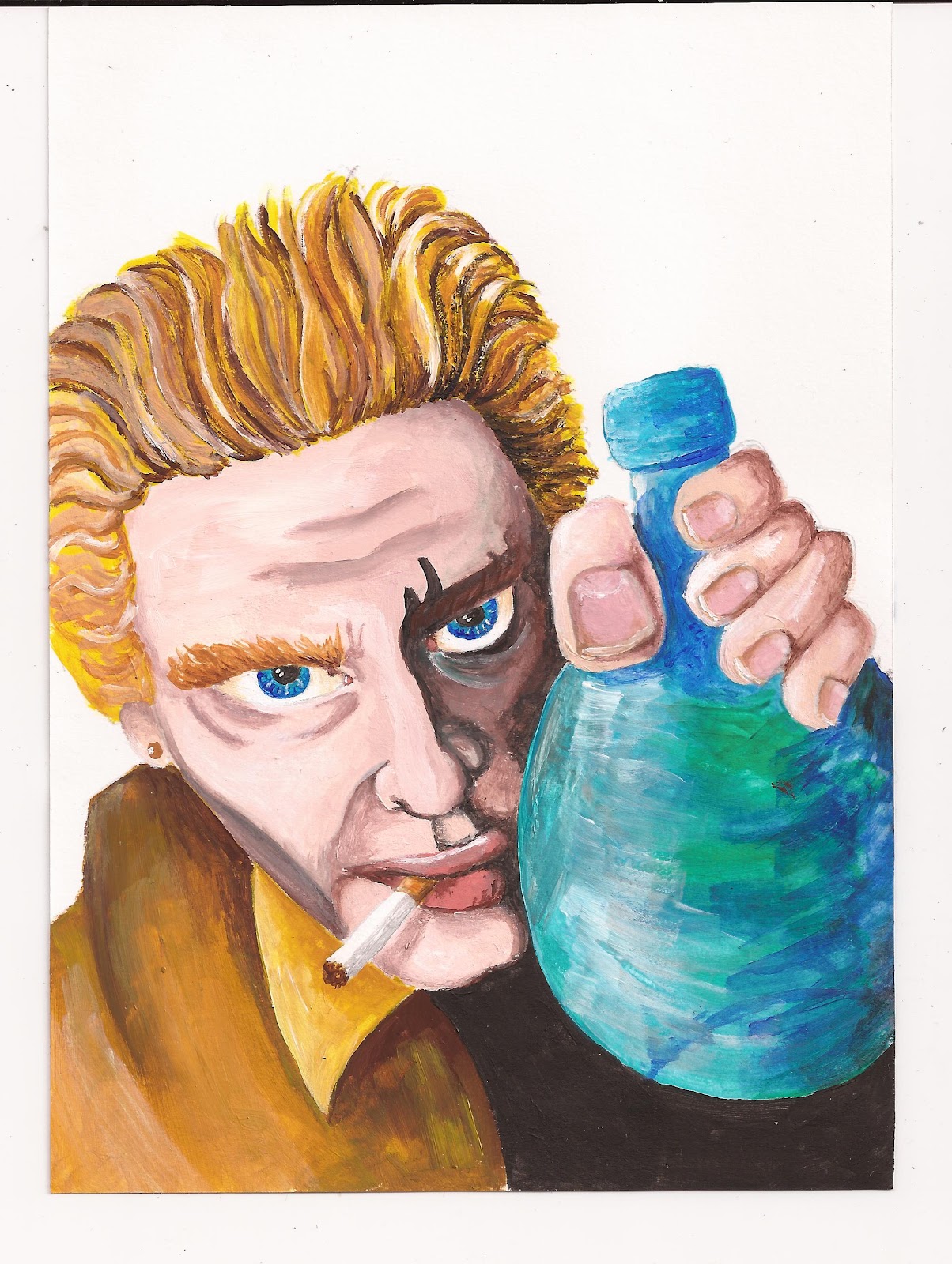
I then started with the pencil sketch of Constantine. I have a bottle the same shape as the one in the pictures so I take a photo of my Papa holding it so I can get the hand right. Might still need a bit of work round the mouth. I'll then finish the pincture in the same way as the fly, paint and fineliners. I drew him smoking as this is one of his largest character traits. Also then I can position cigarette smoke in the foreground, projecting the viewer into the position of Constantine. In theory Mnemoth should also be reflected in the bottle and so on.. I'll have a look at what this looks like towards completion time, it might be too much, we'll see.
Sorry about the weird picture layout, blogger had decided to change all the settings, and it is really bloody annoying.
I started off by doing different sketches, for ideas for the cover. They were mainly character based as I prefer this kind of illustration in general. Lots of the sketches were based on a kind of entrapment concept.

I decided to carry on with using the large fly portrait combined with the bottle that is used for containing the dmeon Mnemoth in the story. I liked it how Constatine was on almost all of the covers but sometimes indirectly, so I wanted play with this as well. I thought at first I could position the bottle behind Mnemoth with Constantine's reflection in it but as soon I sketched this I found the composition really dull. Instead I positioned Constantine as a reflection on the eye holding the bottle. I already thought this had more potential. I then change the positionn of Constantine within the eye. My preference goes to the straight on portrait as this is more forceful (like Constantine) while the other is more of a worshipping pose.


I then started to illustrate the fly portrait. I had said earlier that I was going to try and focus on bringing more unity to my work and look at combining painting and pen drawing. I have already tried this out with a picture of Herne (Clannad "Legend" CD Cover). At first as I said I was quite happy but after leaving it for a while and coming back to it I decided that it was too digital. I liked the background and thought it successful: painted but due to photoshop layers a extra dimention of light was added. My main problem was that the ink drawing was too rough and that the large amount of digitally added details were, well too bloody digital. I decided with my fly to start off by painting the portrait in acrylics the same way I always do: pencil drawing to mark out basic shape then paint over the top in a relitively realistic manner. Looking at my visual mind-map I used the green which seemed to be very dominant and added what has become a trademark colour, brown ochre :D. I then quickly painted a very rough insect leg and used a black fineliner over the top to test it out before I started on the fly portrait. I then went over the painted portrait highlighting the shapes, adding extra shadow and details such as the hair. I was and am very happy with this result. These really are the two ways of working combined that I enjoy the most and I feel that they really compliment and strengthen each other.


After having down this I photoshopped the painting into a rough template of the cover to see how it would look and I added the sketches of Constatine in the eye. I didn't think it was quite there at first so I enlarged the fly, zoomed in and tilted it. Now looking at it it's actually too close up so I need to get a composition between the two. Obviously the text colour, still needs to be played with and the background will be different, black elements on Mnemoth enhanced etc but that all in the fine tuning at the end.


I then started with the pencil sketch of Constantine. I have a bottle the same shape as the one in the pictures so I take a photo of my Papa holding it so I can get the hand right. Might still need a bit of work round the mouth. I'll then finish the pincture in the same way as the fly, paint and fineliners. I drew him smoking as this is one of his largest character traits. Also then I can position cigarette smoke in the foreground, projecting the viewer into the position of Constantine. In theory Mnemoth should also be reflected in the bottle and so on.. I'll have a look at what this looks like towards completion time, it might be too much, we'll see.
 |
| WIP Constantine |
zaterdag 14 april 2012
Hellblazer Cover Research
Thursday, 12th of April
Research: Background and Imagery
I have definitely picked the first issue of Hellblazer to illustrate the cover for. It is part 1 of 2 of the storyline "Hunger". The story is about John Constantine, a moody chain-smoking anti-hero, who is tracking down the cause of strange occurances. He discovers they are linked to the hunger demon Mnemoth and then continues to contain the demon in the second issue.
To start I looked up Mnemoth, I was curious whether he was actually a historically listed demon or devil. I discovered he wasn't but was in fact created by the writers in this very episode of Hellblazer. The demon causes people to devour what they desire (food, comics, women, themselves etc.) with full compulsion and they eventually die from starvation as the demon drains them of their life force. Mnemoth appears in the form of a monstrous giant fly or a swarm of locusts.

With a real interest in this character I want to focus on Mnemoth and these themes in Hunger. First of all you see here the original cover, with and without the text. I have also added the pages that refer visually to Mnemoth and some pages of the hunger compulsions. I picked out a few existing covers to put on my first research page as well. I discovered that Constantine is always on the cover (except on two or three of the more recent covers, out of more than 150 indiviual paper comics this is pretty minimal) whether in the foreground or in the background. On one of them he's in a mugshot lying on the table with someone else sitting behind the desk. So he doesn't need to actually be on it personally to on the cover.

As always I also made a mind-map of my thoughts and research discoveries.

While searching through the National Geographics I found an article on "Flies that Fight". I thought this was a pretty good visual source to keep at hand. I also researched other source pictures on the internet.

I finished off my research by making a collective page of images relevant to the atmosphere needed for the cover. Colour wise it seems to have come out at mainly greeny-browns with hints of red. Naturally it is of a very dark atmosphere and mainly creature/people based.

Abonneren op:
Posts (Atom)