Posts tonen met het label Legend CD Cover. Alle posts tonen

woensdag 20 juni 2012

CD Cover completed!!!!

Although I haven't printed the CD Cover yet I have finished illustrating it and also got it ready for printing.

I was originally just going to make it as a standard CD Cover in a typical jewel case but I decided to go with the carboard covers often seen on folk cds special editions and any others that want to be a bit different.  I definitetly prefer them to the jewel case covers anyway. 

Because of this the booklet changed slightly so instead of seeing this....


 ...you'll see this:


So basically when the cd cover opens you have the booklet glued in on the left with this as a seethrough first page.  On the right will be a card pocket for the CD to slide into.

The next challenge was the text to put on the front.  At first I thought I could use arrow shapes to go with the archery theme but it ended up looking too Metallica.  Then I tried doing kind of trre shaped letters which really didn't work.  Instead I went with rounded letters which I felt went a lot better with the whole atmosphere.  Here you can see I accidentally did a j instead of a g, oops.


 I got it right on the cover though.  I used the tracklisting page I previously made for the booklet on the back and stuck with the golden theme I had previoulsy ised on the text.


 Next I added the title to the CD sticker:


And finally I designed theCD pocket.  I just used the same painted texture as before to keep it all a good unity.  I decided to put the lyrics to their song Ancient Forest here as they were an important part of the concept and I feel they will add meaning to the booklet and help the viewer get more out of the concept.


 I have printed out the tree pages on the transparant paper; they look really cool.  Amazingly enough I only jammed the printer twice :P


zaterdag 9 juni 2012

CD-Cover... Getting There :D

The next challenge after having painted all of the pages was of course to add the backgrounds.  To get the backgrounds in I had to rub out all of the white on paintings in Photoshop.  This took horrifically long and was very torturous :D but I can't stand it when people cheat on this and it ends up looking crap so I just took my time.

As I had done in my earlier Herne experiment I painted the background in two layers: acrylic and ecoline.   I stuck mainly to green based backgrounds to keep the foresty feel but I did make them different greens because I felt that went better with the different tree concepts.


It took a while fiddling with the colours but I'm happy with them like this.  After having done this I painted the trees for the transparant pages, I kept them reletively simple and managed to get them all done in a day which, considering my usual speed, was great.

Lots of green trees here for Robin to hide behind. The right-hand half will be on transparant paper overlaying the Robin page and the left-hand page will be on normal paper. I was going to add the credits thoughout the other pages but when I tried that the pages became so chaotic I felt it was better to do it like this.


Here's Herne's oak tree. I kept it over to the left so that you can easily see Herne but that Albion will only be revealed after having turned the page.


This is the front half of the circle of trees...


...and this is the back half of the circle of trees.  As you can see (and as I've mentioned earlier) this section is on two pages.  It is in the centre of the book so there had to be a double page due to binding order.   Also by overlaying the two pages there will being more depths to the circle of trees and make it more comprehendable.


I decided to go for leaning trees for the battles page because they always remind of the way two armies storm towards each other.  And also obviously a stump as a symbol of destruction.

I quickly put the two pages over the top of each other in photoshop to get the general idea before printing.  Obvioudly they will look a bit different.


This is the start of the CD Design.  It will have text on it as well like the text above.  I tried at first by taking details out of the above pages by I decided I didn't want anything too complex as there's already a lot of imagery.  


 I'm really happy so far with this project.  Although it seems like it's taken a long time, if I did it all in one go I could have probably made it in 1,5 to 2 weeks so that's not so bad considering the amount of work that goes into the painting.


woensdag 6 juni 2012

Battles

Tuesday and Wednesday, the 29th and 30th of May and a bit of Thursday the 31st of May

These days were basically the big push to get the last major page done for the CD Cover.

I did enjoy doing these pages but I don't really feel it's a realistic of doing a CD Cover.  I don't feel that I would ever get a decent amount of money for a CD Cover to warrant all of the time I've spent on these paintings.  It's not so bad if it's just for a one image project but having to a whole series like this is not too good.  Although I was happy with the outcome this stage and I am glad I took the time to do it like this.


donderdag 24 mei 2012

Robin and his Merry Men

Wednesday, Monday and Tuesday, 16th, 21st and 22nd of May

Last week I made sure I had both of the sketches for the CD Cover ready to go.  I decided to leave out the Will Scarlett page because I didn't really feel it was a vital part of the story.  I felt that the main parts of the story/theme could be brought across with the other four songs I had picked.


The picture here shows my general proces for the Battles page.  I thought I would go for a kind of ambushy scene (combining Battles with Darkmere) so I found a reference picture of Little John and Robin doing a bit of archery.  I then just draw some people on horseback and after having looked up the soldiers in the TV series I added the correct outfits to the wee blokes on horses.  The faces aren't quite right but that will be alright once it's painted.

On this day I also finalized the Together We page.  The past week I spent Monday, Tuesday and an hour on Wednesday painting it.  Yes it really did take that long but I'm really happy with the result so it doesn't matter.


This is a quick recap of the previous sketches and here is the painted page...


Remember this painting fits on an A4 page so I can scan it,  so the fact that there's less detail on some faces is because they're one centimetre on the page.  Next week I'll be painting the Battles page.


maandag 14 mei 2012

Robin, The Hooded Man

Tuesday, 8th of May

Today was pretty frustrating.  I started off okay I realized that the head and the hood on the picture were too big so I fixed that then the painting was fine as I started with the clothing, then I got to the face and it just wouldn't bloody work.  I did numerous different layers and I couldn't really get there.  After lunch I decided to carry on with the rest and did the hands.  I was a lot happier with those.

I actually ended up removing the face completely casting him into shadow and making the figure alround more mysterious.  I think that's one of the exciting things about Robin Hood, he really is a "Legend" we have no idea whether he was real or not.  I think by actually leaving him anonymous he fits in better with the whole legend theme.

I made the contrast quite high on this version, not quite sure if that's right yet, will see when I finish off the page.

I also quickly tried out printed on tracing paper with the ink jet printer today to see whether it would be possible to use it for the tree page.  It did smudge a bit but I think if I can keep the paper straight it should be okay.  I prefer this to using sheets because it's got a slight whiteness to it which obscures the next page a bit more adding to the mysteriousness (is that a word? :S).  Also normal printers of course don't print white so it will make the images look a bit less odd.  Obviously also this is the distance get paler so it should help add depth.    

vrijdag 4 mei 2012

Herne

Tuesday, 1st of May

As I have decided to do my booklet with the see-through pages I have to make two of the non-tree illustrations one page illustrations opposed to spreads.  These are Herne and Scarlet Inside.  The Herne page had originally been drawn as a spread so I had to re-hash it to a one-pager.  I quickly adjusted the composition in photoshop so I could trace it make the pre-paint pencil sketch.  It also had to be mirrored so that the hand would not be on the same position as The Hooded Man page. 


I photographed a hand holding a (wooden) sword to get it right, although it is a feminine hand I don't think the painted version has been too badly effected by it.  The same thing was done for the smaller hand holding Herne's arrow.  As you can see, locked away in my room, I've discarded the daily routine of doing my make-up, charming innit'? 


 I don't have a record of the pre-paint pencil sketch anymore as I painted straight over it without scanning.  I kept it pretty realistic as that's what I love doing and, well... that's enough reason to be honest. I still need to add the text ALBION onto the sword and I would image the song title will be going onto the cross-guard of the sword.


Earlier on in the day, I also drew out the Hooded Man sketch more accurately which is now ready for painting this coming Tuesday.  I might need to make his chest a wee bit broader it doesn't quite look right.


donderdag 26 april 2012

Starting Sketshes and Overal Design Idea

Wednesday, 26th of April

Selected Songs from Legend:

  • Robin the Hooded Man: As he is the main character and cannot be left out
  • Herne: he is a visually interesting character and an important part of the Legend element of Robin Hood, also known as Herne's son. His connection to the Druids and the Oak make him a vital element.
  • Together We: This song marks the togetherness of the Merry Men and Marian. The circle of trees can help accentuate this idea
I would say these three are a definite must, picking between battles and Strange Land is a bit of a hard one, I think Battles will probably be more visually interesting. The next choice is between Scarlet Inside and Lady Marian. I think the addition of Scarlet Inside will be more interesting than Lady Marian, but then there's the factor that Marian is probably a more important part of the legend than Scarlet is. I start with the other songs and will make this choice further on. I think I'm leaning towards Scarlet thought purely because its more interesting with the split tree etc. and a good lead onto Battles.

So that potentially makes it the numbers: 1 (green Lush Forest), 3 (Old Gnarly Oak), 4 (Circle of Trees), 7 (Split Tree), 9 (Clash between Dark and Green). Luckily this is relatively wide spread so I don't have to fit loads of song titles onto one page and then only one on another. Jolly Good!

Booklet Insert: 242mm x 120mm (Fold on 121mm although the images with be based on the spreads and not the pages)

Allow a bleed area as will need to be cut off when stapled.

As I said in my post on the Hellblazer cover the previous image of Herne is not quite right, too much digital etc. I will colour the images with paint and ink. Then in photoshop I can enhance elements and potentially add light enhancements such as in the background of the Herne picture. 

Right well those were the general thoughts of the morning.  I then started by trying to sketch out page 1, Robin the Hooded Man.  The first couple of sketches were very dull, see images for comments at the time.


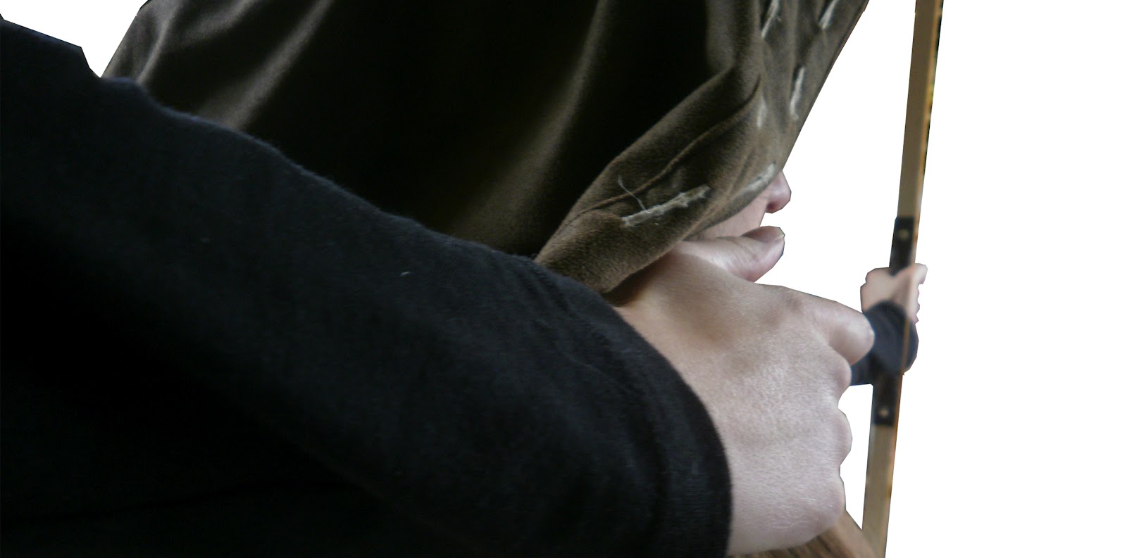
I decided I wanted Robin in the picture firing an arrow.  I wasn't quite sure how to draw this so I got out my camera, my hooded jacket (of which I copied the hood of Robin's) and Phoenix's bow.  I'm not holding back the string because the bow is too small for me.  I then roughly cut out the photos to see what pose angle and size was right.  I tried combining poses but I found this too busy and not clear enough.  The bottom one was the one I picked which I quickly sketched out in pencil.


 I then continued with Herne.  I don't even know what I was thinking during the first couple of sketches so I won't bother including them here, just bad composition, uninteresting etc.  I then had a look through my Robin of Sherwood photo vault and found this photo.

Here you see Robin holding Albion, one of the swords of Wayland, before Herne.  I really love the myth of Albion added to the story and I liked this idea of Robin kind of kneeling before Herne.  I tried it by taking photos but it really didn't work.

The idea that you're staring at the back of Herne, peering over his shoulder to see Robin.  The pose is wrong (the eyes are blacked out because they were looking at the wrong spot)  and the composition just doesn't work.  I carried on by just sketching without the camera.  Funny how it can work so well for one thing and not another :D


This was the first go. I thought possibly I could rotate the book so it was standing but when thinking about the other pages I changed my mind so I carried on.  At first I kind of just randomly added in Albion, more floating on top of the picture than actually being included.


I then drew Herne holding out Albion as if he were offering it to the viewer and left Robin out.  As we just saw Robin in the previous page he's not particularly a necessity and I'm better off to focus on Albion.  I will have to mirror the image though otherwize the enlarged close-up hand is practically in the same spot as the previous page.

Then I continued with page 3, Together We in the theme of all  the Merry Men.  I was getting a bit tires and didn't quite know what to do and just sketched directly from one of the photos which was a bit pointless as I can't just shove in a picture the same as the photo.  I then drew the circle of trees meaning to put the Merry Men in but wasnt really too excited by that either.  I likes the trees but I wasn't bothered about putting the people in.


I then had a look at my inspiration pictures and found this one. 

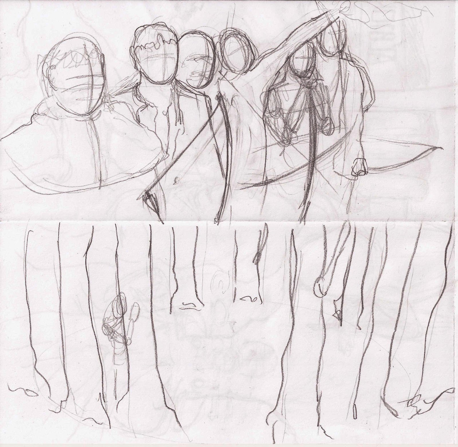
Ii was mainly looking at the head together in different scales, not the atmosphere.  Although it's an idea often used, for example numerous Star Wars and Lord of the Rings posters I always think it quite an effective way of putting a whole load of characters in one page.  I sketched it standing and lying down, both incomplete at the moment, as I briefly reconcidered using a standing page.


I had been having trouble integrating the tree concept into the pictures which I thought was a real shame.  I was thinking about something completely different when suddenly an idea popped into my head which was actually pretty cool!  My idea was to do have the printed image pages on paper and alternate this with painted trees on plastic see-through sheets.  This way I could still include the tree theme and in fact to more effect.  Each tree theme will lie over the top of the picture making you look through the trees to see whats behind.  Only when you turn the page/walk through the forest do you really see what's behind them.  I made a dummy version of the book, it was a bit tricksy at first but I've got it now.  It will be folding and stapled/sewn like a normal cd-booklet.  The pictures will now become squares instead of panorama.  The exception being "Robin" and "Together We", for those I have found a fold that will allow them to unfold.  Robin will start by looking like this:


and will then fold open to become this (as shown above):

This will even give the effect that the string is being pulled back as you open up the page.

The middle page of the booklet in a sheet meaning that there are two tree pages following each other.  This is perfect as it is before Together We.  This song is connected to the circle of trees.  The first page can be the front of the ring and the second page can be the back of the ring which will actually add extra perspective. It will also make the book less of a 1, 2, 1, 2, 1, 2 pattern.

And that was it for today :D