Last week I received emails from both Meghan and Ben.
Like Godmachine, Ben Templesmith gave some very handy tips to improve my picture. He too pointed out the light direction problem and that I had to make it more clear from which angle this was coming. He also felt that the fly should appear dirtier to make it more scary and more within the theme. He personally also felt that the colours were too much and that I should limit them a bit to try and add extra definition on the reflection.
Meghan was really happy with the designs and she said it technically was definitely printable. As she has trained as a printmaker I was thrilled to hear this. One of two things pointed out was that the print on the front of the T-Shirt needed to be lifted a bit, I agreed so I have. The second was that the design may not print well on the cup due to it being coloured print on a black mug. She did suggest that of the whole thing was printed onto a layer of white this may work. She felt that the concept was an original and interesting take on the play and added a new angle to it. She thought that the design would sell well in their shop and that it would be good for both genders. She said a whole load more but I've printed that out tell you about later.
Posts tonen met het label Globe T-Shirt. Alle posts tonen
Posts tonen met het label Globe T-Shirt. Alle posts tonen
woensdag 6 juni 2012
vrijdag 25 mei 2012
You Spotted Snakes with Double Toungue
Wednesday, 23rd of May
This week I rounded of the Globe T-Shirt and complimentary product range designs. I started off by colouring in the design for on the back of the T-Shirt.

I used the same colours as on the front design which both come to a total of six colours. I then made out the template for the back T-Shirt.
 Having done that and still having time spare that, which happily surprised me I continued to apply the two designs to some of the products in the Globe's range. The badges were quite tricky as a lot of the pictures weren't very well visible on such a small space. I figured if the badges were made with a 3 cm diametre instead of the smaller ones they would be okay. Some of the badges still aren't completely right, but Meghan said herself that the presentation sheet mainly to give a general idea and was all we decided on. After having made the bookmark I figured this would also be a cool bumper sticker so I added that comment on the presentation sheet.
 I am very happy with the final designs for the product range. I think the range works really well together as a whole and I feel I've created an original new take on the 16th century play.
I emailed Meghan today with the designs so I hope I get a reply soon. I also asked her about the Pantone colours and so on because I'm not quite sure which ones they should be. If they are different I will just have to change and match them the best I can.
This week I rounded of the Globe T-Shirt and complimentary product range designs. I started off by colouring in the design for on the back of the T-Shirt.

I used the same colours as on the front design which both come to a total of six colours. I then made out the template for the back T-Shirt.


I emailed Meghan today with the designs so I hope I get a reply soon. I also asked her about the Pantone colours and so on because I'm not quite sure which ones they should be. If they are different I will just have to change and match them the best I can.
maandag 14 mei 2012
Front T-Shirt Design
Monday, 14th of May
It ended up taking the whole day to get the colours right for my T-Shirt design. I was having difficulties figuring out how to do it. I tried doing it by colouring bits in with pen, scanning them and then rying to adapt them but this just didn't work. I also tried using the halftone settings in photoshop but I didn't really get the effect I wanted either. I figured that first of my actual pen drawing didn't have quite enough detail in it so I added a bit extra.
 I decided to purely colour it in digitally. This is very different to the general illustration style I am trying to develop, but my general style just unscreen-printable. I really enjoy doing T-Shirts like this, it is in a similar manner to the manner in which I designed my Symphonic Sci-Fi T-Shirt. The colours are all blocks so they can easily be screenprinted onto material.
 As you can see I changed the colours a lot. I couldn't really find the right colour to go with red and green for the faeries which would allow them to stand out enough. I love purple so I tried that out and I think the blue looks really cool. I decided the background splodge was too flat so I used the texture of a tree stump to make it look more interesting. I decided to add the detaile on the faerie wings as well because I felt they were lacking.
To round off I put the picture on to my T-Shirt templates. It doesn't work at all on a white sheet as it gets completely lost but I think it looks wicked on the black one.


It ended up taking the whole day to get the colours right for my T-Shirt design. I was having difficulties figuring out how to do it. I tried doing it by colouring bits in with pen, scanning them and then rying to adapt them but this just didn't work. I also tried using the halftone settings in photoshop but I didn't really get the effect I wanted either. I figured that first of my actual pen drawing didn't have quite enough detail in it so I added a bit extra.


To round off I put the picture on to my T-Shirt templates. It doesn't work at all on a white sheet as it gets completely lost but I think it looks wicked on the black one.


T-Shirt Drawing etc.
Monday, 7th of May
Obviously first of all I had to finish off the design for the front of the T-Shirt. (I was thinking also if it would make the T's too expensive to do both sides they could also be two seperate designs.) It took me a wee while to get it right and I tried out different thinks with the text which I have no record of as I rubbed them out, oops. As I drew it on A3 I then had to trace the lines with pen onto two A4 sheets of tracing paper. Because they were seperate it took me quite some time to get a good digital image.
 I then played with it in photoshop purely to try and figure out the colours (I'll be finishing that off today, as in the proper colouring) as I can only use eight printing colours. It with be on a black T-Shirt so then the outlines can simply not be printed just the body colours. Can potentially also be on white but black will look more wicked. This is as far as I got last week colour-wise. The faeries still aren't right they don't really stand out enough. Obviously all the shadows are really rough because it was just for me to get an idea. I still have to figure out the wings too.
 It still needs a lot of fine tuning but that will happen today, hopefully also the second image will be completed today. I just realised this image underneath isn't the adapted one, if you look at the 'd' in midsummer at the top picture then you'll see the right one :D
Obviously first of all I had to finish off the design for the front of the T-Shirt. (I was thinking also if it would make the T's too expensive to do both sides they could also be two seperate designs.) It took me a wee while to get it right and I tried out different thinks with the text which I have no record of as I rubbed them out, oops. As I drew it on A3 I then had to trace the lines with pen onto two A4 sheets of tracing paper. Because they were seperate it took me quite some time to get a good digital image.


vrijdag 4 mei 2012
T-Shirt Design
Monday, 30th of April
Today I focused on getting the design for the Globe T-Shirt down. I still wasn't quite sure at this stage what to do. The previous week I had played around with putting Titania at the front and the monsters/bugs behind but I felt this was getting too chaotic. I decided to focus on one creature they could fight of instead of trying to put the whole amount text into one image.
Looking back I also felt that the fairies couldn't just be bugs. I think I mentioned earlier that the bug exterior looked like it could just be armour so I decided to make this the case. The easiest way to show this would be to have one of the fairies holding her bug helmet under her arm exposing her humanoid head. At first I concidered trying to cram this all into one image but thinking this too would be too chaotic I decided to put it as a back illustration.
I hadn't quite decided which creature to do so I just started with the ones I remembered. I think I abandoned the bat idea before I even got started. I continued with the spider which I remembered in the text., the scans of the sketches haven't come out very well. I couldn't really come up with any interesting compositions so I reread the text. I came across the spotted snake and thought this could be quite cool. The first sketch was just to set something down to work from. I thought the head should maybe be closer to the fairy being constricted but that looked too squished and the snake wasn't threatening enough. I thought well what would make the snake more threatening and then the good old hydra sprang to mind. A hydra is a snake-like dragon with multiple heads. when one is chopped it is replaced by three more (I think that's right :S). As this is Greek it fits in fine with the other mythological references. I lifted the top head up high again and added another one closer to the constricted fairy threatening her. I tilted the page a discovered that the composition was better if the head was in the top left corner, hence the box drawn around the picture. The final sketch has the head repositioned, extra fairies and the other head of the snake in a different position to add extra intereaction. I had the arching fairy above the snake head first (you can see it if you look closely) but it completely mucked the composition so I put it below which kept the slanted pyramid cmposition intact.

Before doing these I had done a few of the fairy with the helmet. At first she was holding up the head of the beast, started with bat, then spider and finished with the snake. There were two major floors. First of all it was too reminiscent of the Elizabethan Punk picture I did. Secondly once I had decided that it was going to be a snake there was no way the little fairy could hold up the snakes head and it just looked bloody stupid.

After having done the front sketches I carried on with the snake idea. At first I tried her sitting on top of the snake, which was well... crap!

I then thought she should be standing on top of the snake's head. This worked better I felt. I then went into overdrive on the text and snake which I decided really wasn't right. Also if the image were to be printed like this on the back of the T-Shirt the fairy would have been really small but I want her to be alot bigger. I tried putter text underneath and shortening the snake body. I still not convinced.


I sketched out the fairy in higher detail next so it would be ready to colour. I had to shift the leg a bit because it didn't look strong but more of an unusual ballet pose. I have also sketched out the head a bit better on the snakes for the front sketch but I still need to do the fairies and then I can get to it.

Today I focused on getting the design for the Globe T-Shirt down. I still wasn't quite sure at this stage what to do. The previous week I had played around with putting Titania at the front and the monsters/bugs behind but I felt this was getting too chaotic. I decided to focus on one creature they could fight of instead of trying to put the whole amount text into one image.
Looking back I also felt that the fairies couldn't just be bugs. I think I mentioned earlier that the bug exterior looked like it could just be armour so I decided to make this the case. The easiest way to show this would be to have one of the fairies holding her bug helmet under her arm exposing her humanoid head. At first I concidered trying to cram this all into one image but thinking this too would be too chaotic I decided to put it as a back illustration.
I hadn't quite decided which creature to do so I just started with the ones I remembered. I think I abandoned the bat idea before I even got started. I continued with the spider which I remembered in the text., the scans of the sketches haven't come out very well. I couldn't really come up with any interesting compositions so I reread the text. I came across the spotted snake and thought this could be quite cool. The first sketch was just to set something down to work from. I thought the head should maybe be closer to the fairy being constricted but that looked too squished and the snake wasn't threatening enough. I thought well what would make the snake more threatening and then the good old hydra sprang to mind. A hydra is a snake-like dragon with multiple heads. when one is chopped it is replaced by three more (I think that's right :S). As this is Greek it fits in fine with the other mythological references. I lifted the top head up high again and added another one closer to the constricted fairy threatening her. I tilted the page a discovered that the composition was better if the head was in the top left corner, hence the box drawn around the picture. The final sketch has the head repositioned, extra fairies and the other head of the snake in a different position to add extra intereaction. I had the arching fairy above the snake head first (you can see it if you look closely) but it completely mucked the composition so I put it below which kept the slanted pyramid cmposition intact.

Before doing these I had done a few of the fairy with the helmet. At first she was holding up the head of the beast, started with bat, then spider and finished with the snake. There were two major floors. First of all it was too reminiscent of the Elizabethan Punk picture I did. Secondly once I had decided that it was going to be a snake there was no way the little fairy could hold up the snakes head and it just looked bloody stupid.

After having done the front sketches I carried on with the snake idea. At first I tried her sitting on top of the snake, which was well... crap!
I then thought she should be standing on top of the snake's head. This worked better I felt. I then went into overdrive on the text and snake which I decided really wasn't right. Also if the image were to be printed like this on the back of the T-Shirt the fairy would have been really small but I want her to be alot bigger. I tried putter text underneath and shortening the snake body. I still not convinced.


I sketched out the fairy in higher detail next so it would be ready to colour. I had to shift the leg a bit because it didn't look strong but more of an unusual ballet pose. I have also sketched out the head a bit better on the snakes for the front sketch but I still need to do the fairies and then I can get to it.

woensdag 25 april 2012
Fairies and the Rest
Tuesday, 25th of April
A few days ago I coloured in one of the weta's just to see what ecoline and ink looked like. It was more of a test before I started my fly for the Hellblazer cover to see if that's how I wanted to do it. I decided to do acrylic and ink as I felt personally I had more control of the materials.

Today I continued to work on the fairy design for the Globe t-shirt. Last time I said I would be combining the weta with the more insecty design I had already down. Since that time I decided it would be better if they were a bit more human looking. I thought this would bring the characters closer to the play but also just simply make them easier to understand for the audience/customer. At first I had a look at the head. I tried adding insect features to a human face but that really did nothing at all so I decided it had te be a insect head. I started by adding an insect head to a human body.


I was happy with these but I thought it was a shame to loose so much of the insect body. I also thought there may be an issue with nudity as there are at times younger audiences coming through the shop. This may very well not be an issue, but better something to be avoided in this case. I had a wee flick through the article I found on Wetas in the National Geographic and found a good reference photo for the plating.
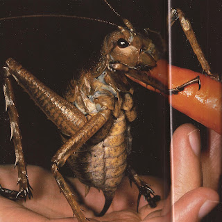
Looking at this picture I added the plating to the original fairy sketch seen above and I was very happy with the result. I think this way of drawing the fairies keeps them original but still recognizable. I kept the little taste/smell? feelerd and the mouth of the weta but I enlarged the eyes as I felt they looked more threatening than the small weta eyes. I kept the feet as weta feet as well but I'm still not sure about the hands, I have a feeling that they sould be human, as if it could in fact be a normal fairy in full armour.

I then continued to draw some other bugs to put into position in the design. I thought something stug-beetle-ish would be quite cool. The darker coloured one was a kind monster version of a stag beetle, the antlers have been positions more as mandibles at the moment. On the bottom one I added a ruff to add a hint of the Tudor theme. I think though that it makes the insects look too friendly in a way.


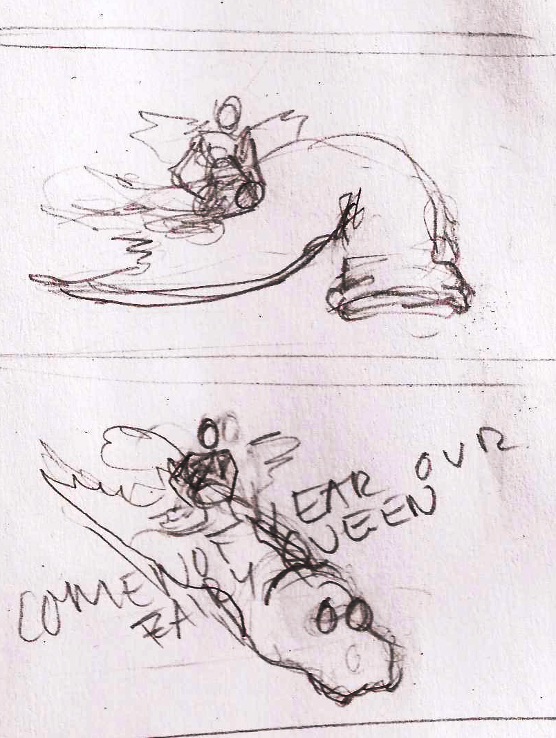
I then did a sketch of a faerie (currently wingless) reclining, thinking of the quote "Come not near our Fairy Queen". It was only done quickly thinking that it could be in the foreground of the image. The text is incorrectly positioned although I think the type of text is quite cool, it's similar to the bug antennae and is of course reminiscent of the natural world. If this image were to be included the pose is probably about right, the front arm on the ground still needs a bit of work, too skinny by the looks of it.

I then had a digital play around with the faeries and the bugs together. The compositions angles etc. are nowhere near right but I shall continue to complete my first sketch for the full design next week. The new faerie (currently wingless) below isn't quite right I know, still really not sure about the hands.


A few days ago I coloured in one of the weta's just to see what ecoline and ink looked like. It was more of a test before I started my fly for the Hellblazer cover to see if that's how I wanted to do it. I decided to do acrylic and ink as I felt personally I had more control of the materials.

Today I continued to work on the fairy design for the Globe t-shirt. Last time I said I would be combining the weta with the more insecty design I had already down. Since that time I decided it would be better if they were a bit more human looking. I thought this would bring the characters closer to the play but also just simply make them easier to understand for the audience/customer. At first I had a look at the head. I tried adding insect features to a human face but that really did nothing at all so I decided it had te be a insect head. I started by adding an insect head to a human body.


I was happy with these but I thought it was a shame to loose so much of the insect body. I also thought there may be an issue with nudity as there are at times younger audiences coming through the shop. This may very well not be an issue, but better something to be avoided in this case. I had a wee flick through the article I found on Wetas in the National Geographic and found a good reference photo for the plating.

Looking at this picture I added the plating to the original fairy sketch seen above and I was very happy with the result. I think this way of drawing the fairies keeps them original but still recognizable. I kept the little taste/smell? feelerd and the mouth of the weta but I enlarged the eyes as I felt they looked more threatening than the small weta eyes. I kept the feet as weta feet as well but I'm still not sure about the hands, I have a feeling that they sould be human, as if it could in fact be a normal fairy in full armour.

I then continued to draw some other bugs to put into position in the design. I thought something stug-beetle-ish would be quite cool. The darker coloured one was a kind monster version of a stag beetle, the antlers have been positions more as mandibles at the moment. On the bottom one I added a ruff to add a hint of the Tudor theme. I think though that it makes the insects look too friendly in a way.


I then did a sketch of a faerie (currently wingless) reclining, thinking of the quote "Come not near our Fairy Queen". It was only done quickly thinking that it could be in the foreground of the image. The text is incorrectly positioned although I think the type of text is quite cool, it's similar to the bug antennae and is of course reminiscent of the natural world. If this image were to be included the pose is probably about right, the front arm on the ground still needs a bit of work, too skinny by the looks of it.

I then had a digital play around with the faeries and the bugs together. The compositions angles etc. are nowhere near right but I shall continue to complete my first sketch for the full design next week. The new faerie (currently wingless) below isn't quite right I know, still really not sure about the hands.


zaterdag 14 april 2012
Final Globe Research and Starter Sketches
Monday, the 9th of April
Final Researching Day
First of all I collected together the pictures from the Globe's website of the Midsummer Night's Dream range and their bestselling ranges. You can really see from the Macbeth and Hamlet lines, that the darker themes sell far better. I also looked at existing images of Midsummer Night's Dream. They are generally of a very light mood so it will be interesting to put a more dark twist on it.

I then continued by making a mind-map of information and specifications. This was followed by a mind-map focusing on atmosphere, quotes and elements I found particularly interesting, faerie-character design ideas, which creatures were present in the scene etc. There are basically the faeries and the creatures of the night. I feel that scale-wise the creatures should be far larger than the faeries as this will make the faeries seem far more fierce if they can hold off/kill such huge beasts.


I continued my research by making a visual mind-map. I focused on lighting, colour, atmosphere, scale and a little bit of creature research. On this page I also included a section to typography, I don't generally remember to do this until later on. I think text made of natural substances, such as sticks and twigs really could be quite cool. They fit within the natural world scene but also have a scariness to them if left bare (no leaves).

I then built up a decent database (61 images - below a small taster) of photos of the creatures in the text as source pictures for drawing.


Tuesday, the 10th of April
First Sketching Day
As Meghan and I discussed, the faeries should be scary which is actually mythologically correct. Faeries are not kind sweet things, they are mischievious pests. As I want the faeries to look a bit different to your regular faeries I focused the day on developing ideas for that. The other creatures in the illustration will probably only be larger in scale and a bit scarier. I started by doing some general sketching, basically just what came to mind. A lot wasn't right, but there were a couple of interesting ideas in there.


Some were a bit insect-like (skelletal frames and six legs/arms) which worked well for the idea of making them scarier but still faerie-like.


I wasn't quite happy though at first and thought it would be interesting to make a faerie with bird-like elements. Philomile singing is a reference to a mythological lady who was raped by her brother-in law and afterwards was turned into a nightingale. I thought that this could be an interesting base for making the faeries bird-like. I did some bird studies first. I then very quickly remembered (from earlier projects) that I really don't like misforming birds to create other creatures. I couldn't just use the wings because that would make them angels and I couldn't completely substitute the faeries with birds because this to me doesn't leave enough magic in the story. The faeries need to be foreign but still something you can relate to. Nightingales don't exactly have that fear factor either.


I then went back to the original sketches and thought about the insects. I had to be careful how I made them look because there are some insects that are driven away by the faeries, actually only beetles come to think of it. I thought about which insect I find most terrifying. The answer would be the weta. This a a giant grasshopper which lives in New Zealand. It has really long antennae and there are hooks on the ends of their legs so they can lock their grip onto things. Theoretically they're harmless, but bloody terrifying all the same. I started again by doing some study sketches to just properly look at their anatomy. That's as far as I got so when I pick this up again I shall be combining the weta with my original insectoid sketches and then continue to sketch out some different scenes with the faeries in them.


During the day I also searched through our fifteen year collection of National Geographics (just looked at the spines for relevant subject titles, not page for page :P) for good source images for this project and the other projects.
vrijdag 13 april 2012
Part of A Midsummer Night's Dream Script
To start off, here is the part of scene II that I will be basing my project on. I thought I should keep it seperate from my general update post, so here it is.
SCENE II.
The wood. Enter TITANIA, with her RETINUE
TITANIA
Come, now a roundel and a fairy song;
Then, for the third part of a minute, hence;
Some to kill cankers in the musk-rose buds,
Some war with rere-mice for their leathern wings,
To make my small elves coats, and some keep back
The clamorous owl that nightly hoots and wonders
At our quaint spirits. Sing me now asleep;
Then to your offices and let me rest.
She reclines. Fairies sing and dance.
FAIRY I
You spotted snakes with double tongue,
Thorny hedgehogs, be not seen;
Newts and blind-worms, do no wrong,
Come not near our fairy queen.
CHORUS
Philomele, with melody
Sing in our sweet lullaby;
Lulla, lulla, lullaby,
Lulla, lulla, lullaby:
Never harm,
Nor spell nor charm,
Come our lovely lady nigh;
So, good night, with lullaby.
FAIRY I
Weaving spiders, come not here;
Hence, you long-legg'd spinners, hence!
Beetles black, approach not near;
Worm nor snail, do no offence.
CHORUS
Philomele, with melody
Sing in our sweet lullaby;
Lulla, lulla, lullaby,
Lulla, lulla, lullaby:
Never harm,
Nor spell nor charm,
Come our lovely lady nigh;
So, good night, with lullaby.
[TITANIA sleeps.
FAIRY II
Hence, away! now all is well:
One aloof stand sentinel.
[Exeunt Fairies.
Abonneren op:
Posts (Atom)