Friday, 4th of May
I had to look up a few Lion Source pictures in the morning because I realised I hadn't done that yet. After that I did my usual study drawings. I had a look at lions from different angles with different facial expression. I also drew to lion portraits from the photos I took at the British Musuem, the large Assyrian Lion and the seated Egyptian Lion.
After that I really wasn't too sure what to do to be honest. I doodled a bit and nothing too productive came out. I had liked the look of the sketch of the Egyptian Lion so I traced that and changed it a bit so it was less stony and added a headdress. Result: too bloody Narnia. None of it was scary and I ended up with a range from beetle-lion to camp-lion. I hate having to put some of them on here but ah well...
Right so the lion wasn't working out. What is scary and something to do with creatures. Well when in doubt.. draw skulls :D. Keeping Eddison in mind ("If I find 10,000 ways something won't work, I haven't
failed. I am not discouraged, because every wrong attempt discarded is
often a step forward...."), I went back to the drawing board. First of all I drew two skulls as a base to start figuring out a creature.
I then traced the top skull and added some bits to it to make it bordering on alive. It's actually quite terrifying when I look at it like this, I might need to tame it down a little bit for Doctor Who. That put aside I would say I'm definitely a step closer here than the earlier sketches of the day. The mass underneath his left eye is supposed to be chain mail by the way not frog spawn, quite tricky to draw actually. Anyway I thought it would be quite cool to do a kind of zombie-ish monster lion. Only appearance-wise obviously, it can still run like the wind. Although the eyes look really scary like this theyy do have that I'm so insane and will never hestitate kind of look. I made the pupils human because they kind of looked like breasts otherwise, but that could just have been my mind playing tricks on me :P I'll carry on with this concept next time. The mane really doesn't look like it's coming out of his either more like it's behind him.
Here's a cool head I found at the good old British Museum by the way. It was very cool, can't remember if I have posted it already or not so will post again now. I mention this as I was thinking about the head when I thought the lion could be more skelletal. I could add more flesh to my lion face like this head here, it wouldn't be so terrifying then. As this head is quite close to the LOTR orcs and my nine years old brother loves LOTR that should be closer to the correct Fear Factor Level.
vrijdag 4 mei 2012
Skulls, Abbeys and Theatres...
Actually only one of each :D
Thursday, 3rd of May
The day was started by painting the Abbey and the skull from the V&A. I did the building quite roughly as I knew if I did it with painstaking detail that I could possibly die in the long process, obviously a slight exaggeration there but it wasn't really necessary either to do that much detail. I did the building first then the skull.
I then added black outlines to the building in photoshop, this took annoyingly long compared to doing it with pen. As I mentioned earlier I can't do the pen straight onto the painting because the black doesn't scan black. After having done the building I suddenly thought, duh just put tracing paper over the top and draw the black lines like that. This way they'll match perfectly and I still be able to enhance the layers seperately. I shall do this from now on.
I might change some of the outlines on the Abbey because I'm not very happy with it at the moment. All it's done is make it look more wonky. I will me doing it again when I doing the skull by hand.
I also painted the Globe Theatre, exterior only.
This too will have the lines added by on hand by using tracing paper. I hope to make the thatch look better as well. I know it's not completely perfect perspective-wise etc. but I very rarely draw buildings, I avoid them in fact. So I think so far I'm doing pretty well considering.
Reflection of Constantine
Wednesday, 2nd of May
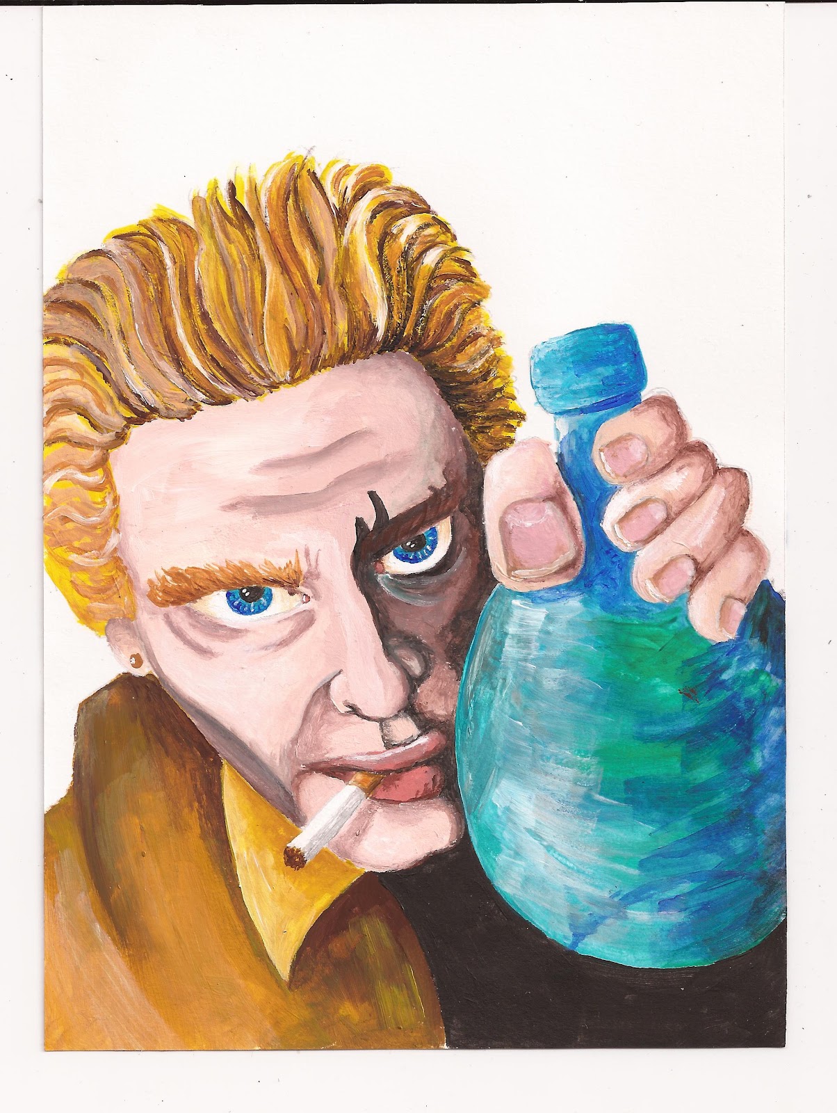
First of all I had to paint Constantine. Most of the drawing was ready to go, I just had to touch up the hand a bit. I didn't pay great attention to accurate colour as I knew these were going to be altered in photoshop anyway when he would become a reflection in Mnemoth's eye.
Once scanned, I added black outlines and extra shading in photoshop. I had discovered on the fly illustration I did earlier that when I draw the pen outlines on directly they don't scan as black but dark brown due to the reflection. Brightness/Contrast in photoshop doesn't help as this alters the colour too much by the time the lines are black.
The colours are still pretty scary but I've already explained that. He definitely looks more sinister in this one that the first version which is good as he is an anti-hero after all.
The next thing I had to do was digitally go over all the pen lines on the Mnemoth illustration, frustrating but necessary. Then I added Constantine into the eye. I just played around with the Layer Settings until I got the right combination. I tried reflecting Mnemoth in the bottle but it was too much and really didn't look good so I flagged that idea.
Then I had a look at the background. I roughly painted red over black matching the negative shape around Mnemoth. I combined this with some different photos to see what effect it would get. I tried an old graffitied door in Berlin which was interesting but not right; I combined it with Hiëroglyphs from the Berlin Antiquity Museum which was cool but the use of Glyphs was irrelevant to the story.
Not having the right answer yet I had a wee think. Something occult.... uh yes of course, in the British Museum I saw some of John Dee's Magic Tablet. I cobined one of my photos and bingo. Although the item is not recognizable, which is good, it has that occulty kind of feel. I tried it in red with lots of black and red with less black, and I tried it is green. Looking at the red one the dark version was too dark but the redder one looked really cool. The red background combined with the green fly also matched my earlier mood board perfectly. The green background made the whole thing too green so red it was.
After that I tidied up the edges a bit, they still need a bit of work and enhanced the colour of the fly. Mia Mamma also pointed out that the fly's left eye wasn't as shiny as the other one so I fixed that as well (selected the eye, copied it and then adjusted the Layer settings to match the other one.). I've added the basic text, same as the one I used in an earlier sketch just to have a look, it's certainly not the final text.
So all I need to do now is finish off tidying the edges because some still are a bit rough; add the cigarette smoke, both in the reflection and in the foreground; and add the text and other necessary logos in appropriate colours. I think the whites of Constantine's eyes may need a bit more shading as well, they look a bit flat. I want to try and complete this cover over the weekend. Then I'll let it sit for a week so I can preview it. I will then send it to Godmachine. He replies pretty quickly and then I'll send it off to Ben Templesmith, scary...
Herne
Tuesday, 1st of May
As I have decided to do my booklet with the see-through pages I have to make two of the non-tree illustrations one page illustrations opposed to spreads. These are Herne and Scarlet Inside. The Herne page had originally been drawn as a spread so I had to re-hash it to a one-pager. I quickly adjusted the composition in photoshop so I could trace it make the pre-paint pencil sketch. It also had to be mirrored so that the hand would not be on the same position as The Hooded Man page.
I photographed a hand holding a (wooden) sword to get it right, although it is a feminine hand I don't think the painted version has been too badly effected by it. The same thing was done for the smaller hand holding Herne's arrow. As you can see, locked away in my room, I've discarded the daily routine of doing my make-up, charming innit'?
I don't have a record of the pre-paint pencil sketch anymore as I painted straight over it without scanning. I kept it pretty realistic as that's what I love doing and, well... that's enough reason to be honest. I still need to add the text ALBION onto the sword and I would image the song title will be going onto the cross-guard of the sword.
Earlier on in the day, I also drew out the Hooded Man sketch more accurately which is now ready for painting this coming Tuesday. I might need to make his chest a wee bit broader it doesn't quite look right.
T-Shirt Design
Monday, 30th of April
Today I focused on getting the design for the Globe T-Shirt down. I still wasn't quite sure at this stage what to do. The previous week I had played around with putting Titania at the front and the monsters/bugs behind but I felt this was getting too chaotic. I decided to focus on one creature they could fight of instead of trying to put the whole amount text into one image.
Looking back I also felt that the fairies couldn't just be bugs. I think I mentioned earlier that the bug exterior looked like it could just be armour so I decided to make this the case. The easiest way to show this would be to have one of the fairies holding her bug helmet under her arm exposing her humanoid head. At first I concidered trying to cram this all into one image but thinking this too would be too chaotic I decided to put it as a back illustration.
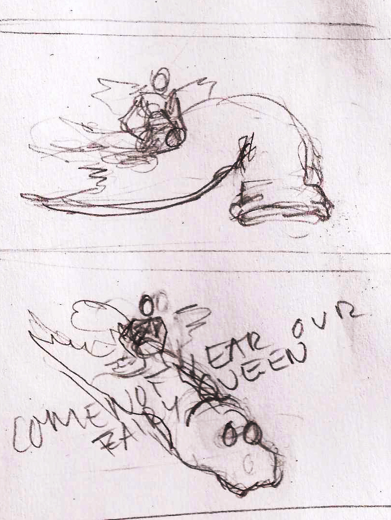
I hadn't quite decided which creature to do so I just started with the ones I remembered. I think I abandoned the bat idea before I even got started. I continued with the spider which I remembered in the text., the scans of the sketches haven't come out very well. I couldn't really come up with any interesting compositions so I reread the text. I came across the spotted snake and thought this could be quite cool. The first sketch was just to set something down to work from. I thought the head should maybe be closer to the fairy being constricted but that looked too squished and the snake wasn't threatening enough. I thought well what would make the snake more threatening and then the good old hydra sprang to mind. A hydra is a snake-like dragon with multiple heads. when one is chopped it is replaced by three more (I think that's right :S). As this is Greek it fits in fine with the other mythological references. I lifted the top head up high again and added another one closer to the constricted fairy threatening her. I tilted the page a discovered that the composition was better if the head was in the top left corner, hence the box drawn around the picture. The final sketch has the head repositioned, extra fairies and the other head of the snake in a different position to add extra intereaction. I had the arching fairy above the snake head first (you can see it if you look closely) but it completely mucked the composition so I put it below which kept the slanted pyramid cmposition intact.
Before doing these I had done a few of the fairy with the helmet. At first she was holding up the head of the beast, started with bat, then spider and finished with the snake. There were two major floors. First of all it was too reminiscent of the Elizabethan Punk picture I did. Secondly once I had decided that it was going to be a snake there was no way the little fairy could hold up the snakes head and it just looked bloody stupid.
After having done the front sketches I carried on with the snake idea. At first I tried her sitting on top of the snake, which was well... crap!
I then thought she should be standing on top of the snake's head. This worked better I felt. I then went into overdrive on the text and snake which I decided really wasn't right. Also if the image were to be printed like this on the back of the T-Shirt the fairy would have been really small but I want her to be alot bigger. I tried putter text underneath and shortening the snake body. I still not convinced.
I sketched out the fairy in higher detail next so it would be ready to colour. I had to shift the leg a bit because it didn't look strong but more of an unusual ballet pose. I have also sketched out the head a bit better on the snakes for the front sketch but I still need to do the fairies and then I can get to it.
TIME COUNT 25/04-27/04
+- 23 Hours
As I said earlier I did not work on Monday as it was my Birthday and even if it hadn't been I was in too much pain to do anything let alone work. Tuesday I was left drained of energy and only did my blog updates for the previous week. I didn't work in the weekend but I worked on Koninginnedag (Queen's Day, Dutch National Holiday).
vrijdag 27 april 2012
Shakespeare Details
Today I made it my mission get all of the loose parts of Shakespeare's London reading for painting as this is going to be quite the task. I am very happy to say that I have just finished. A lot of them took quite long as they have to be drawn small so I can later scan them into the computer to finish off the whole pictures. There's not too much to say today really. Some of them were ok as they were but I shall now show you the owns I fine-tuned today.
I started with the George Inn because I knew I had to put people in the Inn and I wasn't particularly looking forward to it. I have a book at home on Tudor Clothing (and how to make them) so I used this as a reference. Some may not all be from exactly the same time but it´s doesn´t need to really be that historically uccurate anyway, roundabouts is good enough. I put Shakepseare in the corner sitting behind a table with his head back, hopefully he be laughing if I can manage it. Opposite him sits a man calling to the bar maid for another beer. Next to him sits a roll of parchment, could this possibly be one of Shakespeare´s acting troup? The man in the back is hanging over the table looking pretty depressed, good to shove him in the corner so he looks even more alone and tragic. The man at the round table is trying to greet the man coming in in a stiff manner but the man coming into the inn seems more interested in the bar maid. Hopefully that will all become a bit more clear when coloured. I drew it on an A5 so I can at least enlarge it to an A4 for painting.
Next I did the First Folio Bust. It's basically just a literal depiction of the bust. Just as well I fixed it up though, the first one I sketched I realized was practically missing an arm.
Then I did the statue of Shakespeare in Westminster Abbey. I changed the hand a bit so that it was pointing into the eyesocket more. I am concidering to paint the figure as a real person in stead of a statue, or maybe even a statue turning into a real person, colour wise. I say this as it is such a live-like sculpture and when I saw it, it really was like he was standing there himself.
Next was the Stain-Glass Window from Southwark Cathedral. I started off by taking the Midsummer Night's Dream window and the Hamlet window and merging them together in photoshop.
I then drew the pencil sketch version. It seems as though I drawn the donkey head on Bottom too big, although the one in the real window is quite large as well. I'll see whether I need to fix it up or not. This was also drawn on an A5 so I'll enlarge it to an A4 for painting so I don't drive myself insane, well more insane :p, I can do the face and hair then as well, hopefully.
The final major sketch today was the Shakespeare portrait which is positioned next to the Globe in the whole image. I went for the kind of ruggid pirate look to make him look a bit more dishy than the usual weedy balding bloak you see in pictures. I thought the earring was a nice added touch as a fashion of the time. I saw a gold ring in a different painting but I thought the pearl drop was better in this case. I can finish off the final details in it when it is painted, such as hair, shading, clothing patterns etc. Might need to fix the eyes a little bit, slightly off.
The other pictures only had minor changes so I'll just leave those out here.
Abonneren op:
Posts (Atom)