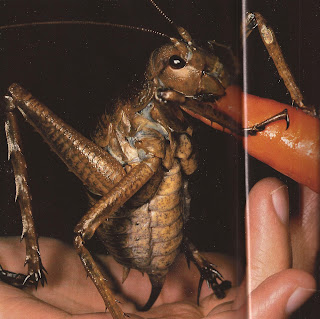
A few days ago I coloured in one of the weta's just to see what ecoline and ink looked like. It was more of a test before I started my fly for the Hellblazer cover to see if that's how I wanted to do it. I decided to do acrylic and ink as I felt personally I had more control of the materials.
Today I continued to work on the fairy design for the Globe t-shirt. Last time I said I would be combining the weta with the more insecty design I had already down. Since that time I decided it would be better if they were a bit more human looking. I thought this would bring the characters closer to the play but also just simply make them easier to understand for the audience/customer. At first I had a look at the head. I tried adding insect features to a human face but that really did nothing at all so I decided it had te be a insect head. I started by adding an insect head to a human body.
I was happy with these but I thought it was a shame to loose so much of the insect body. I also thought there may be an issue with nudity as there are at times younger audiences coming through the shop. This may very well not be an issue, but better something to be avoided in this case. I had a wee flick through the article I found on Wetas in the National Geographic and found a good reference photo for the plating.
Looking at this picture I added the plating to the original fairy sketch seen above and I was very happy with the result. I think this way of drawing the fairies keeps them original but still recognizable. I kept the little taste/smell? feelerd and the mouth of the weta but I enlarged the eyes as I felt they looked more threatening than the small weta eyes. I kept the feet as weta feet as well but I'm still not sure about the hands, I have a feeling that they sould be human, as if it could in fact be a normal fairy in full armour.
I then continued to draw some other bugs to put into position in the design. I thought something stug-beetle-ish would be quite cool. The darker coloured one was a kind monster version of a stag beetle, the antlers have been positions more as mandibles at the moment. On the bottom one I added a ruff to add a hint of the Tudor theme. I think though that it makes the insects look too friendly in a way.
I then did a sketch of a faerie (currently wingless) reclining, thinking of the quote "Come not near our Fairy Queen". It was only done quickly thinking that it could be in the foreground of the image. The text is incorrectly positioned although I think the type of text is quite cool, it's similar to the bug antennae and is of course reminiscent of the natural world. If this image were to be included the pose is probably about right, the front arm on the ground still needs a bit of work, too skinny by the looks of it.
I then had a digital play around with the faeries and the bugs together. The compositions angles etc. are nowhere near right but I shall continue to complete my first sketch for the full design next week. The new faerie (currently wingless) below isn't quite right I know, still really not sure about the hands.


Geen opmerkingen:
Een reactie posten